PREMIER 95

©ASHTON CROCHET 2026

©ASHTON CROCHET 2026

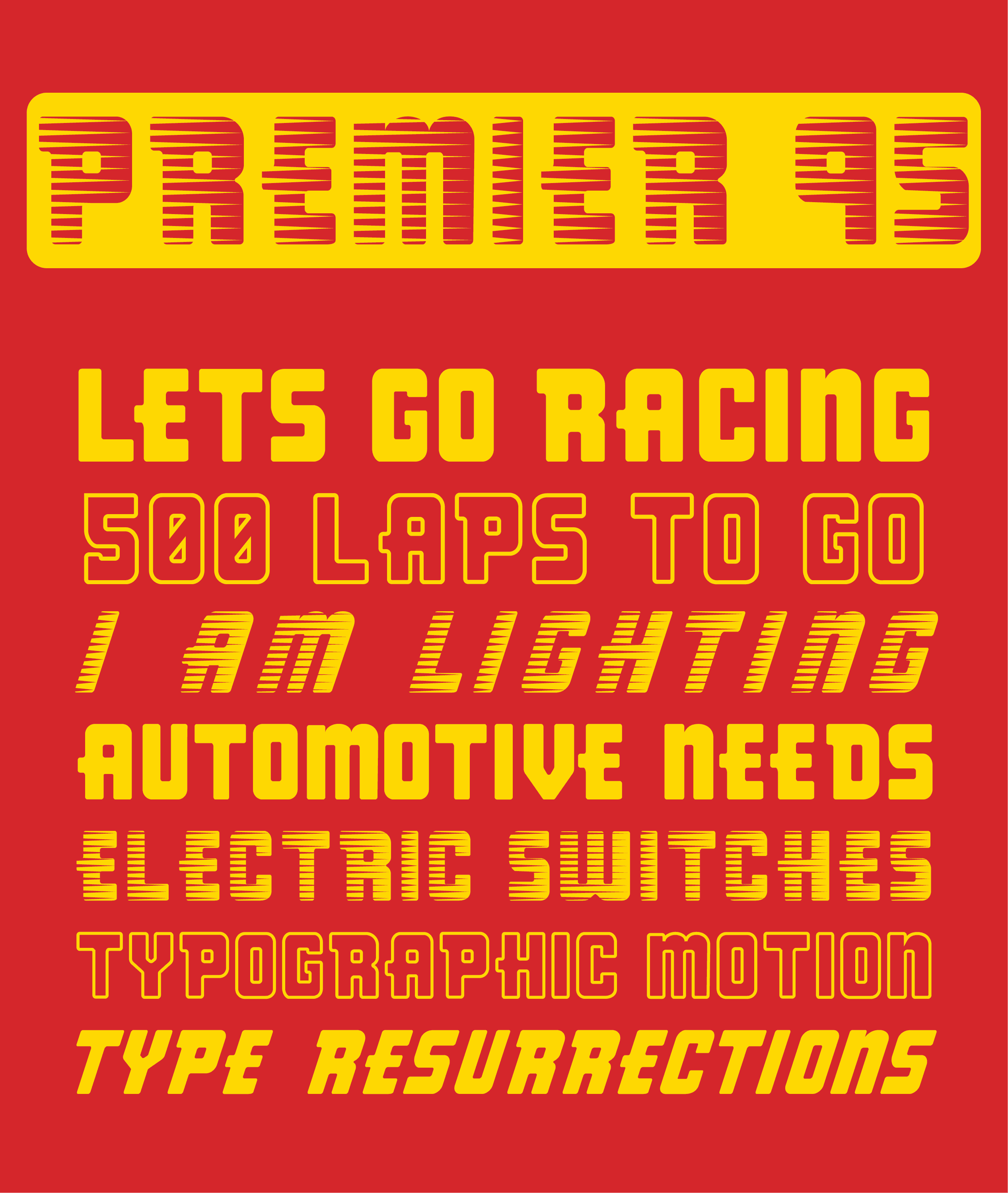
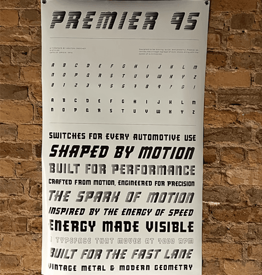
Premier 95 was exhibited as part of a “Continuum: Digital Resurrections Typographic Specimen Exhibition,” an art show dedicated to reviving and digitizing hand-rendered or non-digital typefaces. The typeface was presented along with others in a larger installation context, and I was an active member of the installation team, contributing to the physical setup and spatial presentation of the project within the exhibition.

Designed to be moving, quick, and powerful, Premier 95 revives the vintage signage of auto shops along with the speed of automobiles.   


Premier 95 is a display typeface derived from an automotive sign discovered in Pickens, South Carolina. The original sign read
“PREMIER: SWITCHES FOR EVERY AUTOMOTIVE USE,” and its bold lettering reflected the strength and precision of mid-century automotive design. In vehicles, switches control the flow of electricity, transforming a simple touch into motion and power.


Premier 95 captures the rhythm and motion of machinery through its smooth forms and streamlined proportions. The design translates the speed of electricity and the fluidity of a vehicle in motion into letterforms that feel energetic yet controlled. Premier 95 stands as a tribute to both the mechanical beauty of the automobile and the visual language of motion itself.


Designed to be moving, quick, and powerful, Premier 95 revives the vintage signage of auto shops along with the speed of automobiles.   


Premier 95 is a display typeface derived from an automotive sign discovered in Pickens, South Carolina. The original sign read “PREMIER: SWITCHES FOR EVERY AUTOMOTIVE USE,” and its bold lettering reflected the strength and precision of mid-century automotive design. In vehicles, switches control the flow of electricity, transforming a simple touch into motion and power.


Premier 95 captures the rhythm and motion of machinery through its smooth forms and streamlined proportions. The design translates the speed of electricity and the fluidity of a vehicle in motion into letterforms that feel energetic yet controlled. Premier 95 stands as a tribute to both the mechanical beauty of the automobile and the visual language of motion itself.


PROJECT TYPE

Typography, Layout, Exhibition


DELIVERABLES

Typeface Design, Publication, Exhibition Design


COLLABORATION

Worked as the a member of the installation and print team and collaborated with members of AU Type Foundry to create the Digital Resurrections in Typography Vol. 5 Exhibition and Publication.

PREMIER 95